The
analyse.exe program returns, together with the pictures,
a DAT file, that is a text file with numbers in it.
If the analyse is made with a C2 file present, the DAT
file shows four columns of numbers.
Each row summarizes the information collected during one
second of the CD testes, that is 88,200 samples (44,100
on the left channel, and 44,100 on the right one).
The first number is the time in minutes. One second is
0.0166666... minute.
The second number is the number of C2 errors that were
returned by the drive.
The third number is the number of C2 reports matching a
valid sample, thus the number of
"overdetection".
The fourth number is the number of errors in the wave for
which the drive didn't return a C2 flag, thus the number
of "undetections".
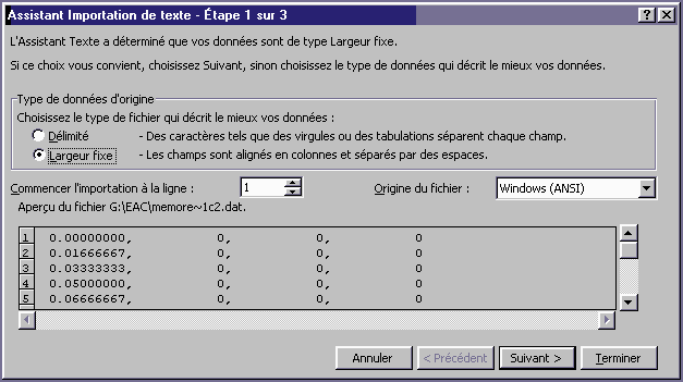
In Exel, open the file with the DAT extention that was generated (to get the extensions, in Windows Explorer, go to "Tools/Folder options/Display and unchek "hide extensions of files whose type is known"). Here's an example with a DAT with C2 info.
In the importation window, choose "fixed width" :
Then, in the following window, use separators in order to leave out the commas :
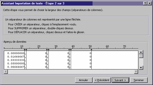
Then, in the following window, check that every field is "standard". You must get something like this :
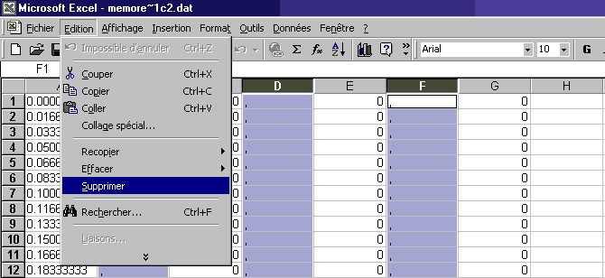
Then, as showed in the picture above, with the help of the ctrl key, select the column with the commas, here B, D, and F, and delete then with the edit/delete menu (the del key won't work).
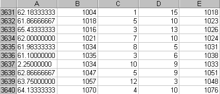
Now, the A column is the time in minutes, with one row
per second, B is the number of reported C2 errors, C is
the number of false C2 reports, and D is the number of
undetected errors.
The total number of errors is B+D-C. To get it, type
"=B1+D1-C1" in the E1 cell. Then select it and
copy it into the clipboard (edit/copy). Now, go to bottom
of the file, line 4441 if your CD is 74 minutes, select
all the cells in the column E until the top (Shift+PgUp),
and paste. Don't select the E column with it's title bar,
otherwise it will paste until line 65536 !
You can check, going to a part with errors, that the E
line is the sum of the B and D columns minus the C one.
Save the file in the Exel format.
Now you can analyse the data.
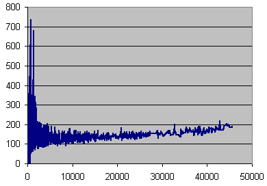
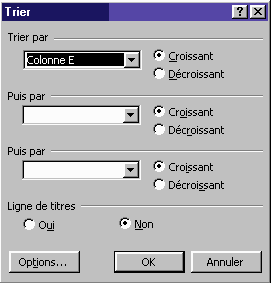
For example, to make a graph showing the number of errors
and the number of undetected errors, go to
"Data/sort", and sort the data on the column E
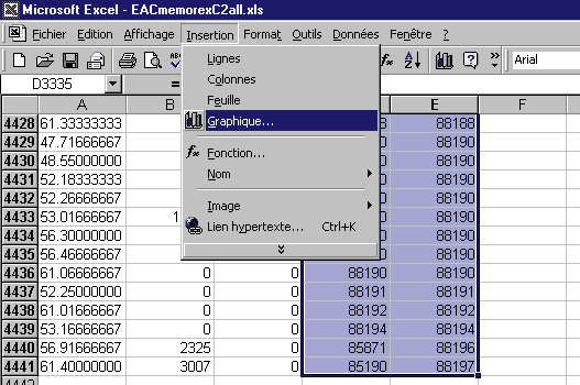
Then, to avoid plotting all the zeros, select the D and E column starting from the first non zero value, and ask for a curve graph :
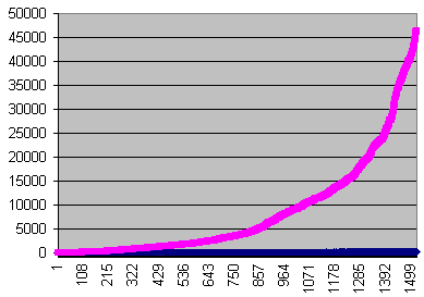
Here, the undetected errors are too small to be visible.
In order to zoom them, define another column in the Exel
file.
Type =100*D1 into the F1 cell, copy and paste it into the
F column, like we did with the E one. Then ask another
graph, but selecting the E and F columns instead of the D
and E.
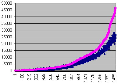
Here, in order to compare with the previous graph, the blue and pink curves have been restored, because Exel swaps them.
In the same way, you can have logarithmic scaling in the graph defining new columns with the logarithm of your data in them.
It is also possible to make a graph showing directly
the undetection ratio against the errors rate. Define the
undetection ratio in another column.
Let F be E/D. The resulting number will give the
frequency of undetection (ex : one out of 100, one out of
500 etc...)
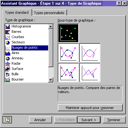
Then select the E and F columns, and go to insert/graph and choose a dot graph
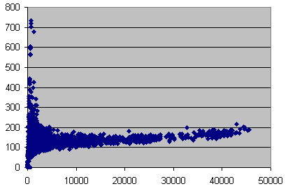
Now you can change the style. Right click on the blue dots, choose dataset format, widen the line and disable the dots.
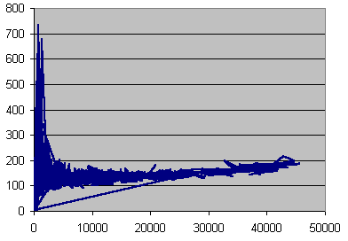
The problem is that the dots are not sorted. In order to get a proper line graph, click data/sort (select a cell in order to get the data menu active instead of the graph one), and sort the whole file on the E column. Use no title line.